CLIENT
Epitaph Records
Epitaph Records has long been a powerhouse in independent music, shaping the sound of punk, hardcore, and alternative scenes since its founding by Bad Religion’s Brett Gurewitz in 1980. I first discovered the label as an angsty teenager at my local Warped Tour in 2009, where I learned a majority of their signed musicians were ones I was banging my head to the hardest, so when I was reached out by them in 2025, It felt full circle to work with one of the best heavy-hitting record labels. That moment stuck with me, making it all the more surreal when Epitaph reached out to collaborate in 2025.
Our shared bold, brash aesthetic made for a natural creative partnership. The projects I’ve worked on with Epitaph have been event-based, designed to capture the raw energy and rebellious spirit of the musicians and venues they support. Check out some of that collaborative design work below!

Bad Suns
Bad Suns is an American rock band from Woodland Hills, California, formed in 2010. In January 2025, they hosted a unique pop-up signing event at Dayglow, a local coffee shop featuring a built-in phone booth where fans could listen to their upcoming album. It was an exciting project to be part of, especially with such a creative way to share new music.
For the event’s advertisement, I illustrated the spot artwork featuring the phone booth. The design utilized a limited color palette (green, black, and white) and detailed linework in a comic book/neo-traditional illustration style. My favorite part? Drawing the phone itself—it was a blast to bring that element to life.


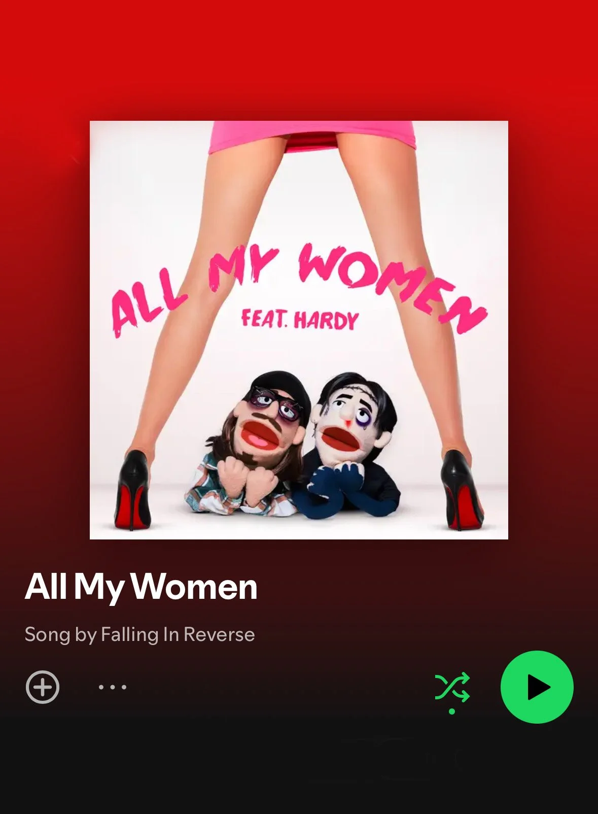
Falling In Reverse
Falling in Reverse is an American hard rock band that formed in 2008. In the summer of 2025, Art Director Jason Link of Epitaph Records reached out with a unique challenge to do the typography for their newest single, "All My Women". The album featured lead vocalist Ronnie Radke and guest rapper Hardy as puppets, gazing up at a striking woman in stiletto heels.
Ronnie Radke, the band's frontman, envisioned the title written in bright pink lipstick, as if it were on a mirror or the album itself; playful and messy like genuine handwriting, but still intentional and legible. I began with pages of handwritten sketches in my notebook, experimenting with variations that balanced rough, natural edges with a sense of polish. After refining five final options based on my own handwriting, I brought the winning design to life, adding subtle imperfections to give it that authentic lipstick-on-glass feel.