CLIENT
The Fixations
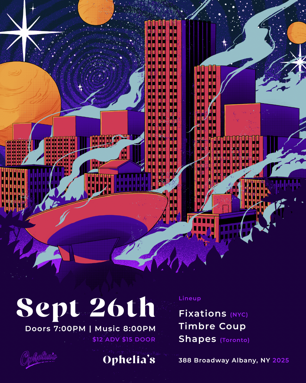
The Fixations are a local Bushwick band with a sound reminiscent of mid-’80s punk. I’ve had the pleasure of collaborating with them on multiple occasions, creating flyers that capture the raw, old-school, and grungy energy of their music. Each design reflects their DIY punk aesthetic, channeling the spirit of underground show culture while visually amplifying their distinct sound.

Flyer Designs
I incorporate a limited yet vibrant color palette, ensuring each flyer stands out while maintaining a cohesive look that aligns with the band’s identity. By experimenting with diverse compositions, I play with the placement and hierarchy of information, making the designs both visually engaging and easy to navigate. This approach has contributed to an increase in show attendance, reinforcing the power of strong visuals in drawing a crowd and building excitement around their performances.


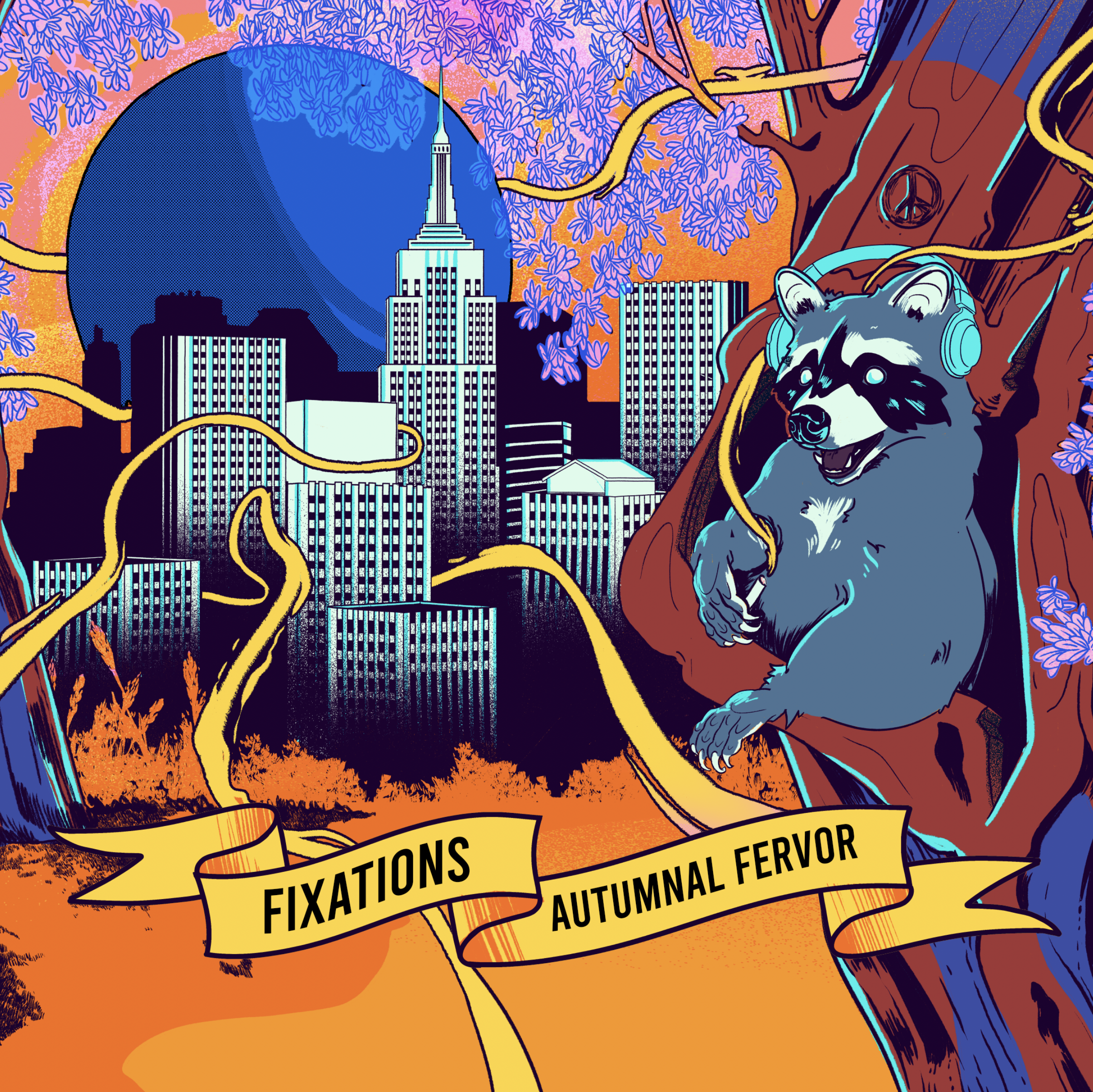
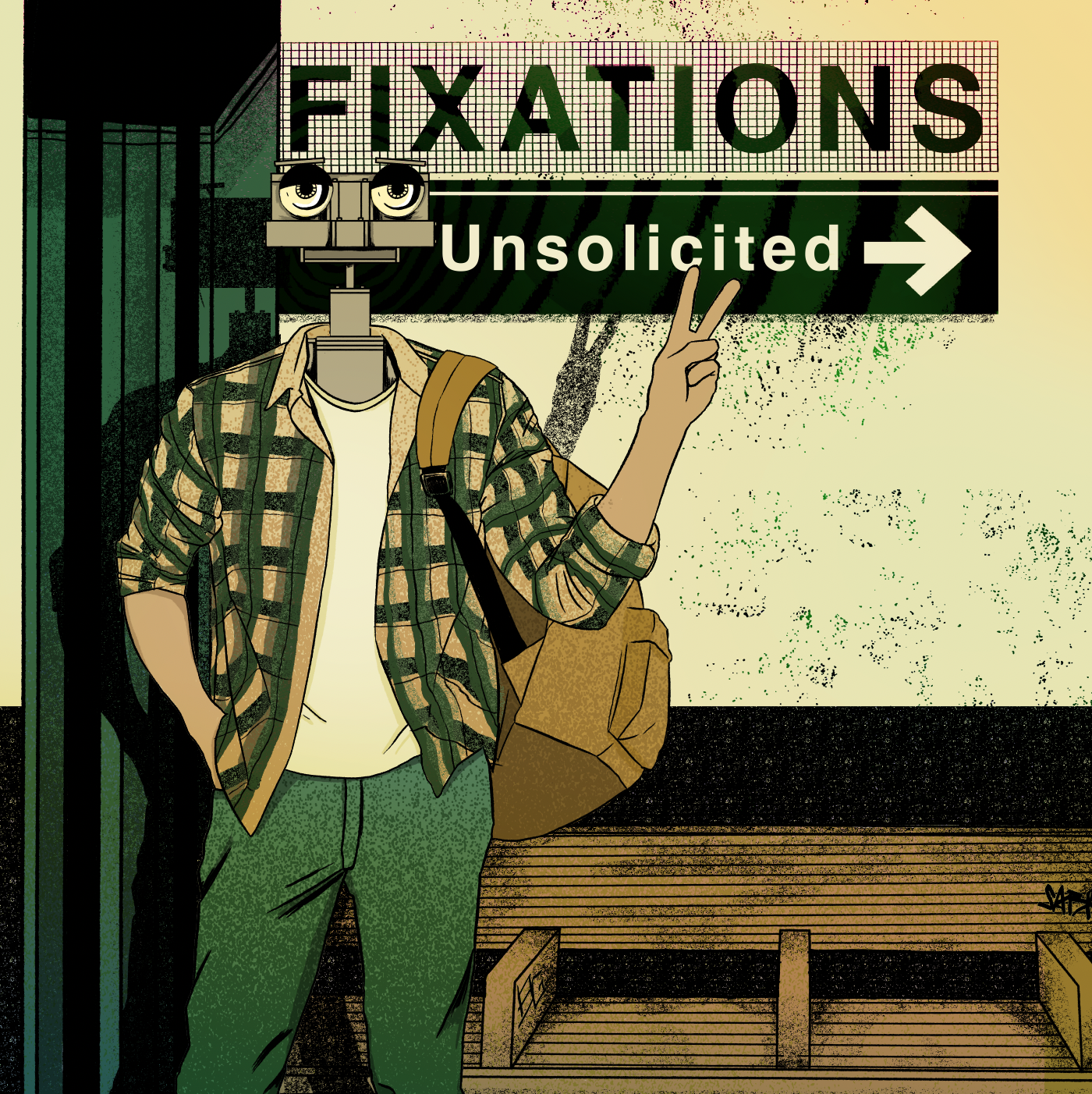
Album Designs
Each album was brought to me with a unique idea from the band with a common theme of “psycadelic” and “vivid colors”. Although the band has harsher tones, they stay true to their free sperit personality and their artwork captures that exactly. The Fixations are a unique band with a one of a kind sound and each project they present to me is a team effort collaberation.